Imagery is a fundamental, if not crucial, part of relaying a story. In so much, I end up flipping through at least 30 to 40 images a day to accompany any given piece of news I'm working on. Sometimes I source the images myself, other times startups and PRs will attach a founder(s) and/or team photo to a follow-up email. What this ultimately means is that I end up reviewing a lot of really, really bad photos.
Adjunct to joining Tech.eu, I've spent just shy of a decade documenting the startup world through event and headshot/portrait photography.
I’ve worked with President Barack Obama, Vice President Al Gore, Steve Wozniak, Sir Richard Branson, Tony Fadel, Pharell Williams, Usher, Ghostface Killah, et. al. on creating evocative imagery that has been published in Rolling Stone, The Wall Street Journal, Forbes, Vice, … and the list goes on.
If a picture truly does say a thousand words, and you’re putting crap imagery out in the world, what does that say about your startup, product, fund?
Exactly.
Let me help you fix that.
Note: No malice is intended. These are just my opinions and advice garnered from 10,000+ hours of shooting, editing, re-editing, and honing a craft. I could be completely full of shit. But I doubt it.
Why your photos suck
Let’s get something straight right outta the box - there’s a very slim chance that your friend, co-founder, or mum has a reasonably good concept of visual composition. I’ve seen imagery arrive from some professional photographers where I’ve had to ask myself the, “Am I the asshole?” question. A few months back I created a Telegram group of some of my favourite colleagues where we regularly check each other’s pulse. 92.8% of the time, I am not the asshole.
The biggest advice I can offer when you’re preparing your publicity photos: Hire a professional. And hire a good one. Talk to your colleagues, talk to your investors, talk to journalists and PR pros that have great images. Hell, talk to me, we'll point you to the right people.
If you think you can’t afford a pro, ask yourself this one simple question, “Can you afford not to?”
Colour Correction
This is perhaps the biggest offender that I see time and time again. For the purposes of this illustration, I'm going to push things a bit, but trust me when I say this; I've seen images very similar to this pass my desk on a number of occasions.
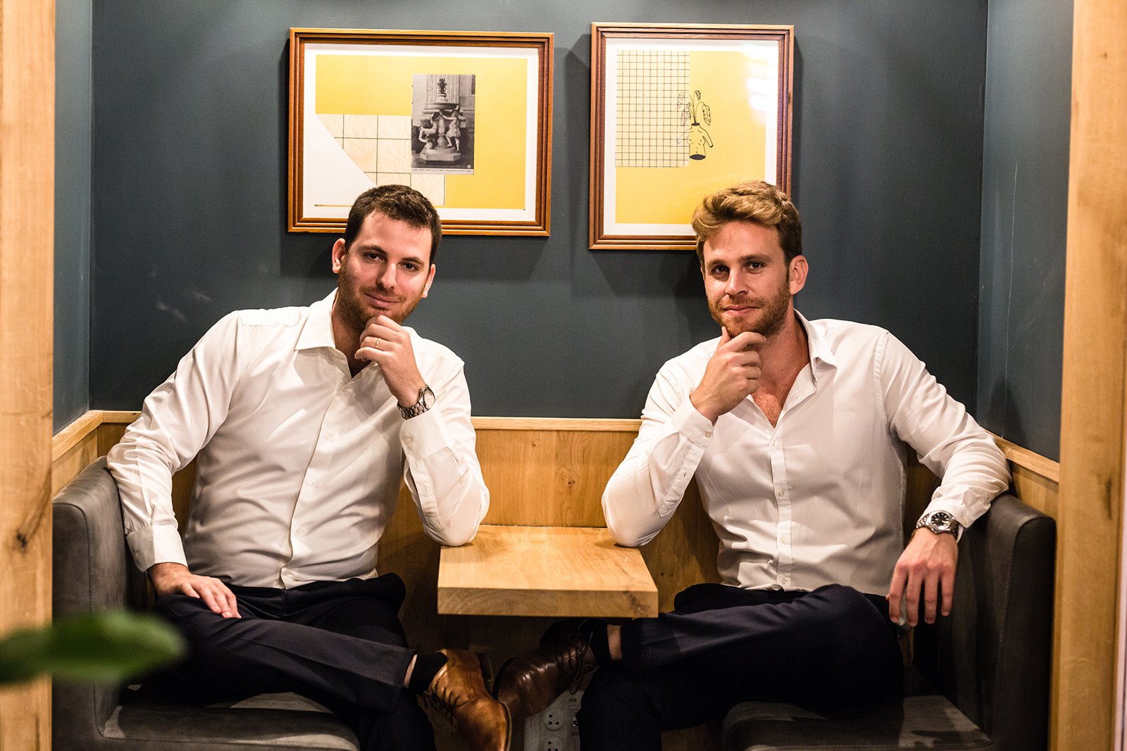
Here's a shot I produced with the one and only Colette Ballou of Ballou PR.
Nothing wrong here, right? Mmmm ... yes. Yes, there is a LOT wrong here.
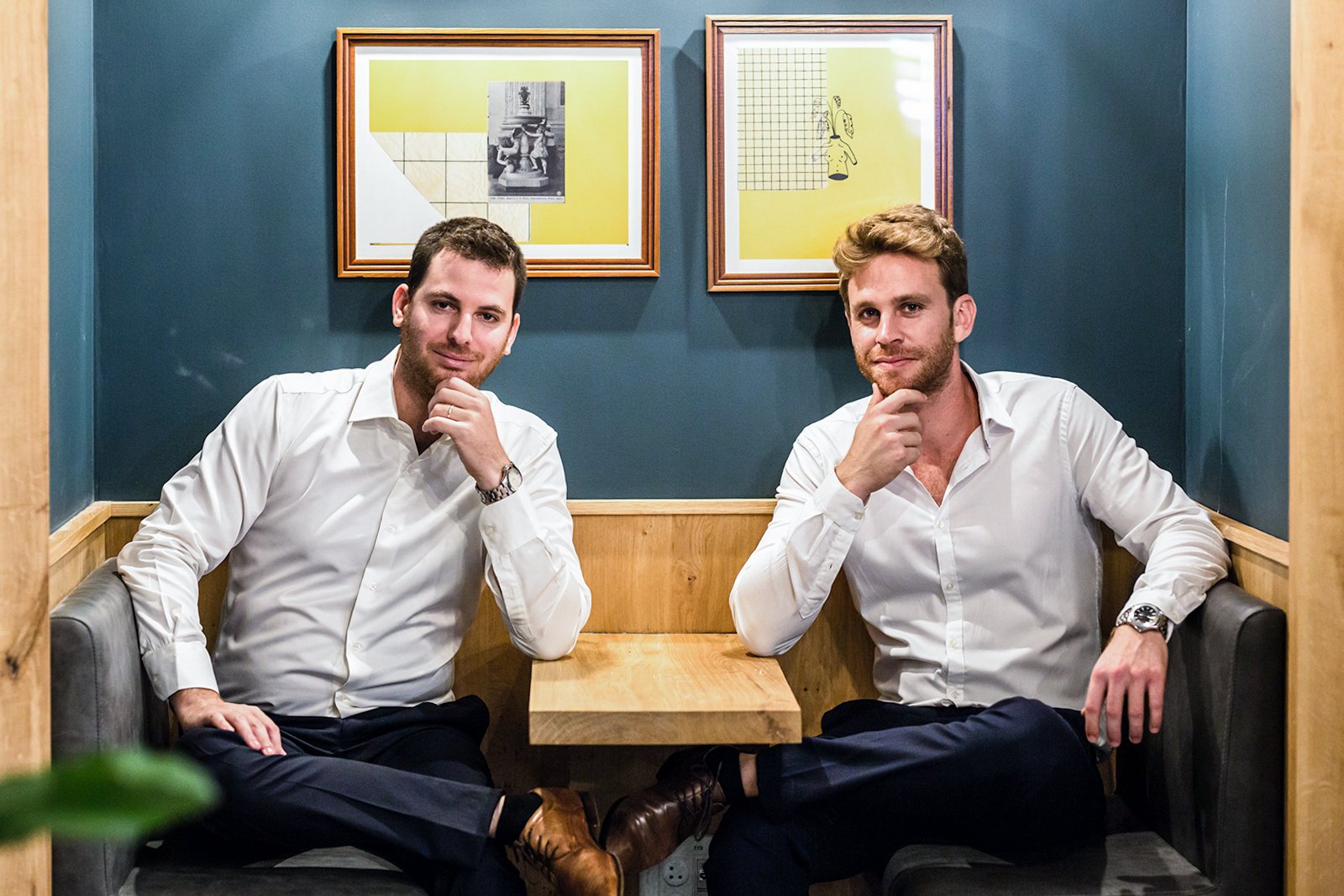
Now let me show you what proper colour balancing looks like.
Et voilà! We went from a heady shade of Oompa Loompa orange to much more natural skin tones. Total time to correct this fail in photoshop? 2.38 seconds.
And speaking of photoshop ...
Bad Photoshop
I understand that sometimes not everyone can be there for the group picture. And that’s fine. But for the love of God, do NOT photoshop them in. Bottom left, “Where exactly is this guy sitting?” Just above him, “Whoa! We’ve got a giant here. Why is he so much bigger than the others?” Far-right, “Man, that’s a really awkward place to put a couch.”
Will your average reader actively notice things like this? Probably not. Robin didn’t see it at first, but the minute I pointed it out to him, we had a good laugh.
I’m honestly hard-pressed to pull an image from my archives to demonstrate because I’ve simply never done it. Ever.
The greatest lesson that’s served me in photography and life: When in doubt, leave it out.
On the level
What the actual hell is going on here? Are these guys on a boat? Can we get a structural engineer in here to have a look at this? ASAP, please? Oh, and could no one move that plant?
Let's set that leaning tower of whoknowswhere upright. While I'm at it, let's ditch the Oompa Loompa look as well. The plant did not want to cooperate.
Focus
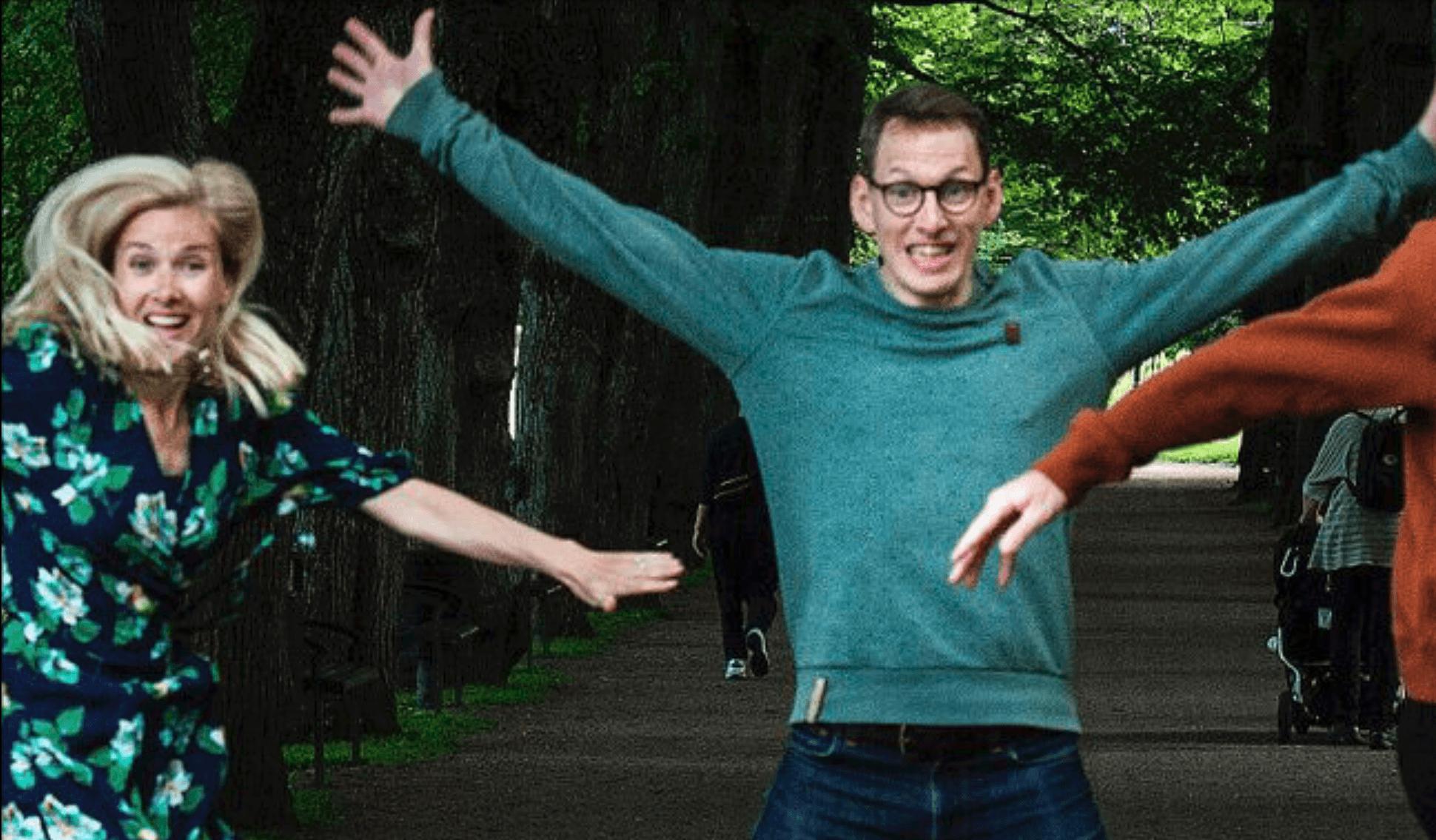
I can't believe I even have to bring this up, but make sure the image is in focus. This was Pale Blue Dot's announcement of closing an €87 million fund. Let's leave the overly used "jump shot" out of the picture for a second. (Please, STOP THIS).
Fine and dandy, right? Let's have a closer look at that.
Notice that the walkers and the trees in the background are in focus and yet our three subjects are quite clearly out of focus? Success is about details.
And speaking of details ...
Mind the background
Similar to levels and perspective, paying attention to the background can be just as important as you the subject.
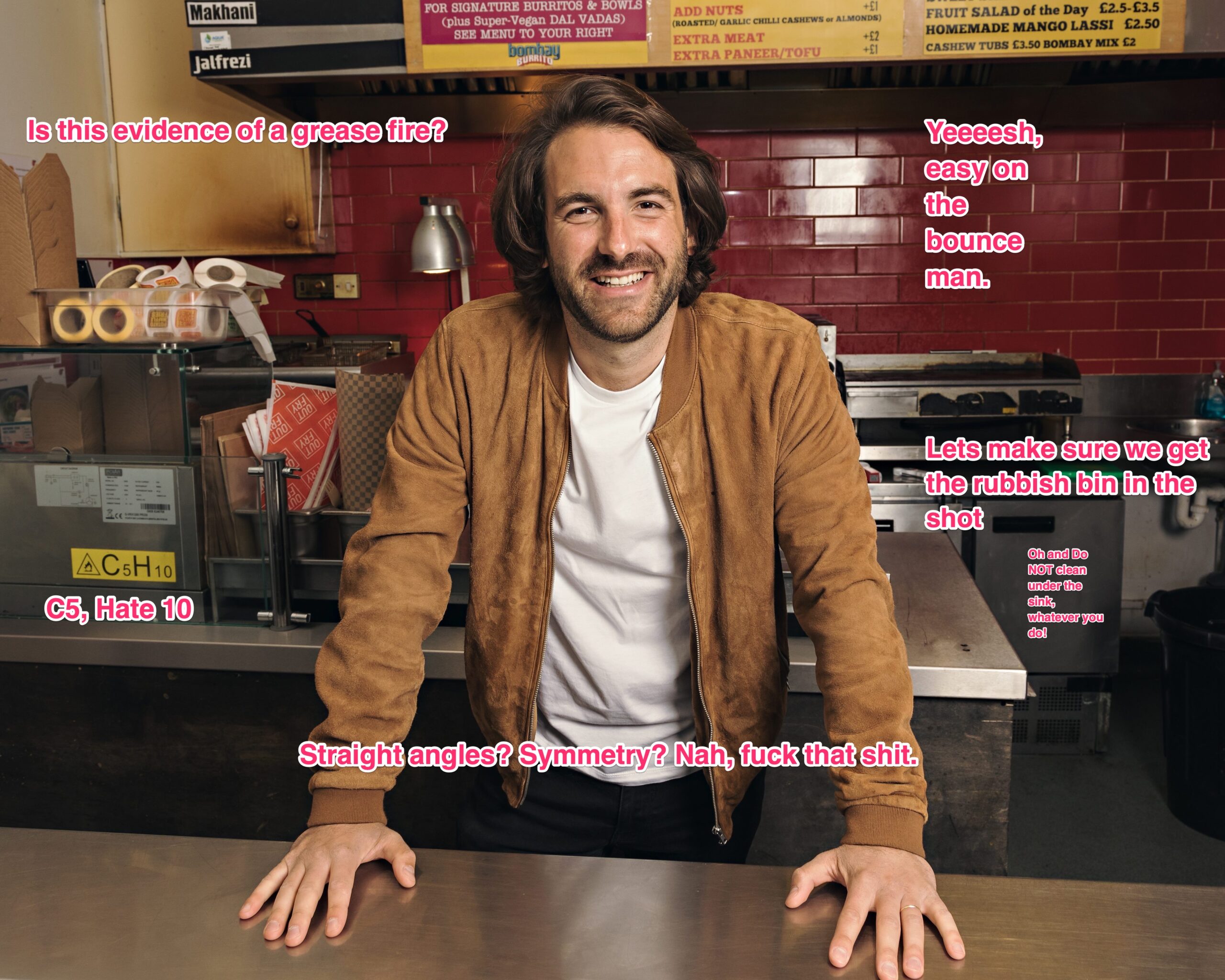
Here we’ve got a shot of Anton Soulier from Taster. This is the shot that accompanied a $37 million funding round. Taster runs a collective of digital restaurant brands. On the surface, founder, kitchen, all good right?
Remember that Telegram group I mentioned above? This is one of the best replies I’ve ever had to my question.
Need I say more?
The Pose
Now, this is one of the most subjective areas, but there are a few things you can get right. And a few things you can get wrong.
Albert Watson and Steve Jobs collaborated to create one of the most iconic tech industry images ever. In 20 minutes, nonetheless. You and your photographer are not Steve Jobs and Albert Watson. Do not even try.
Because if you do, each and every single viewer of that image is going to think, “Oh, it’s ‘the Steve Jobs’. Wait, this company is nowhere even close to Apple.” Do not be that company.
Use some props
When I shot this image of Women in Tech podcaster and "Girl who Gets it Done", Espree Devora, we were fooling around in my studio and I was wearing the t-shirt you see pictured here. She commented on how rad it was, and I literally gave her the shirt off my back.
When I saw it on her, the nerd glasses came to mind immediately, and I asked her to put them on. She wasn’t completely sold, so I asked her to look up at the light source.
Some 8 years later, she still tells me that it is one of her favourite images of all time. And apparently, Clubhouse agreed.
Stop the normal
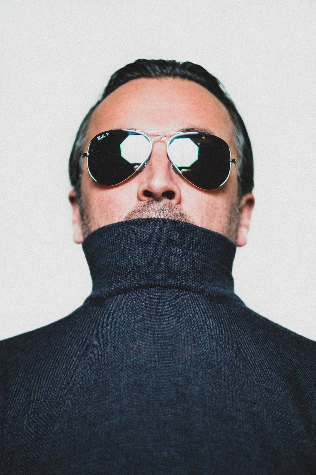
Boris Veldhuijzen van Zanten and I have worked together a number of times via TNW’s events. One memorable afternoon in New York City, I had shot what I needed to on stage, and Boris and I were standing around backstage having a laugh when I said to him, “Hey Boris, let’s make some art?”
I knew I had a big light source and wanted to play with it. The best way? Hand Boris my mirrored aviator sunglasses and let the light do the talking. Never one to remain normal, he pulled his jumper up over his mouth, and, the rest is history.
“Halfway through a very stressful event we organized in NY, @sensorpunk dragged me into his photo studio. I was not in the mood, but he insisted and I’m still grateful he did,” - @Boris
Bonus Material: In January of this year, Cologne-based SoSafe announced that it had raised $73 million in a Series B round (good), but distributed a rather dreadful-looking image of its founders to the media (bad).

Herr Butcher saw the same thing I did, and took to Twitter to ask, effectively, "Can we try a little harder on the founder photos? PLEASE?" After a series of hilarious comments and suggestions, my humble offering was, "SoSafeWerk?" clearly referencing Germany's electro-pioneers Kraftwerk.
Four days later, SoSafe responded:

Not only is this one of the best founders' photos I've ever seen, but it's also the ONLY founders' photo I've ever talked about months and months later.
Be the boss
If you've ever met Barbara Belvisi from Interstellar Lab, you know what a powerhouse she is. So why not show it? Be the boss. Own it.
I have to admit, it didn't take much coaching to get Barbara to this pose, but we did do a few minor tweaks. "Gimme a hand on that hip. Turn the body a bit more towards me, I want to be able to see that logo. Lift that chin up just a bit? There! Do. Not. Move."
Ever notice the shockingly high amount of raised chins on hip hop album covers? There's a reason for this. These artists are projecting an air of authority. They are owning their product, their brand, and their image. Why is your offering any different?
Be the fucking boss!
Lighting
Photography is the art of crafting with light. I can take a subject, have them sit on a chair and give you three different stories with three different lighting scenarios.
Playing with light is one of the most interesting aspects of photography and can really help your shots stand out from the crowd.
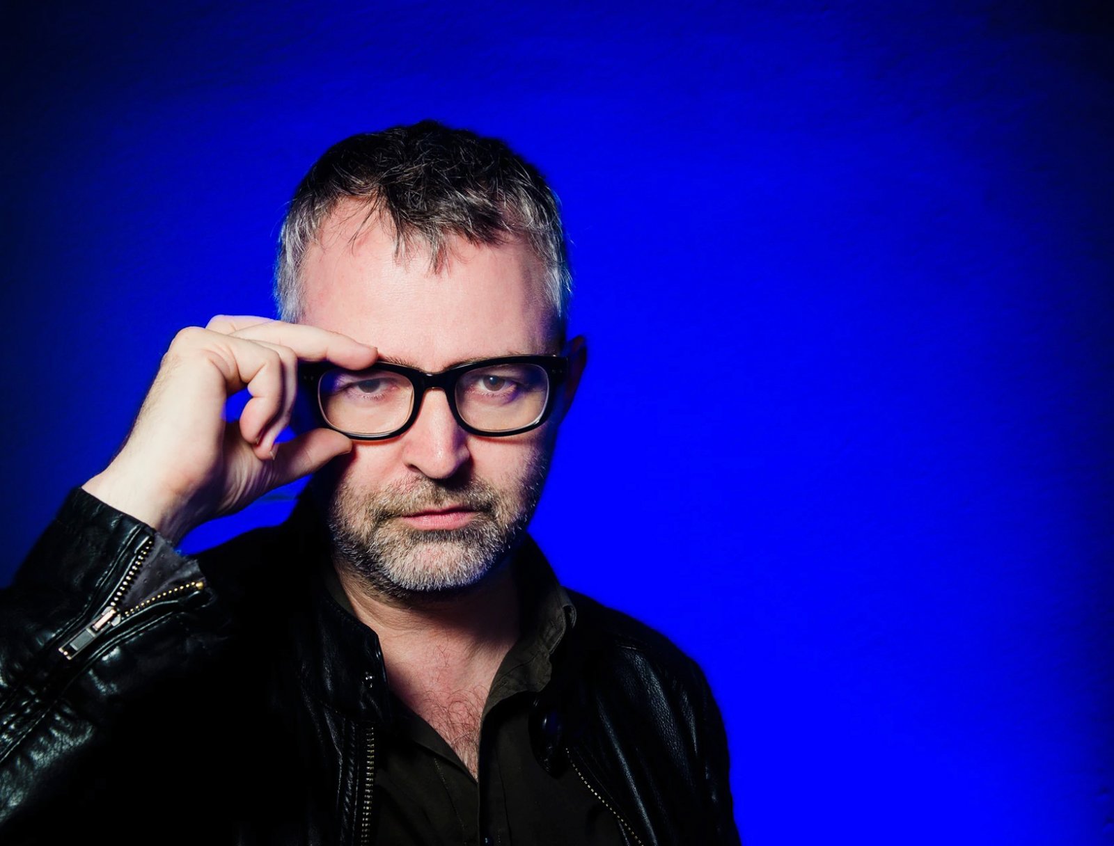
When I shot this iconic image of TechCrunch's Mike Butcher, we did this in a nightclub in Istanbul at 3 in the morning. I spotted a wall bathed in blue light, and grabbed my camera, one flash, and a softbox. I can vividly remember Mike saying, “Oh yeah, I’m a newsman. Let’s get that classic newsman vibe, but updated.”
He also evoked some classic Michael Caine imagery here.
“It was unusual. It had a different background to the average shot. And my stance made me stand out compared to other headshots,” commented Mike.
Note the collaboration here. I did not just capture a photo of Mike Butcher. Mike Butcher did not just pose for a shot. We worked together to create this.
Talk it out
You’re out to present your best self when you’re selling to the media. And your media attention is your first port of call.
Talk to your photographer before the shoot. Make sure they understand your product, your company, your fund. You’re there to create an image together. If you think you can just bring in a hired gun and get some outstanding imagery, ain’t gonna happen.
I hope these tips and examples have helped. Or at least give you pause to think about what exactly your imagery says about you and your offering. Because there’s a snapshot, and then there’s an image. Which one are you?







Would you like to write the first comment?
Login to post comments